We can see different text alignment, bold writing or only the outline of the letters, using capital letter for the whole name or lower case for some of them...
Thursday, 29 October 2009
Tuesday, 27 October 2009
TYPO-Illustrator
Saturday, 24 October 2009
Research Workshop
For this project I worked with Lynn, we had three topics:
(-) what's their favorite hobbies?
(+) writing a piece of text to see the different handwriting
(I) which picture do you have on your desktop?
We chose the second one, but we thought of it as a good idea to compare the English handwriting with the mother tongue's...
when we had all our classmates' handwriting from all our classmate, we started to analyse them..
figure 1 we discovered that only 3/14 were born in London, when the rest wrote in their own language their handwriting became different and new.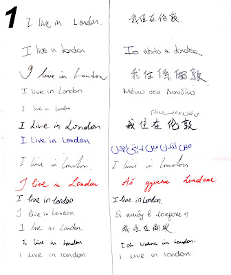

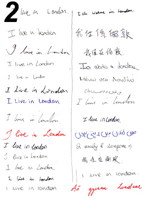
figure 2 even after changing the position on the second column, in some cases you can still understand whose handwriting it is due to ink's color

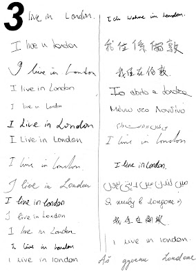
figure 3 but making them all black and white makes it more difficult to understand whose English handwriting matches their mother tongues.

After a research I discovered that emotional energy is determined by how much pressure the writer uses when he writes. If you examine the writing you can determine how much pressure was used by how "dark" the writing is.
Writers with heavy pressure are usually highly successful. They have a lot of vitality and their emotional experiences last for a long time. Writers who write with average pressure are usually moderately successful and usually have enough energy to make it through the day. Those with light pressure try to avoid energy draining situations.
The slant is the second indicator to look for. The slant indicates the writers emotional response to external forces. A right slant (////) signals one who responds strongly to emotional situations. They are caring, warm and outgoing-- their heart rules their mind. A vertical slant (llll) writer tries to keep their emotions in check-- mind rules their heart. A left slant writer (\\\\) will conceal their emotions and is observed as cold and indifferent.
Friday, 23 October 2009
Process Workshop
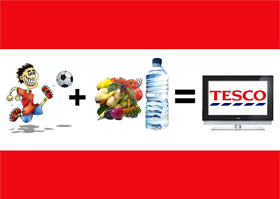
The brief for the process workshop was divided in 4 groups:
- Outcome: Billboard Poster
- Client: Supermarket Chain
- Target Audience: Male Working Class Football Fans
- Message: Rebel
My team's target audience was Male Working Class Football Fans.
The first thing we did was a quick sketch representing our own interpretation of the brief.. we didn't focus much onto each single component instead we drew the first thing that came up in our mind. We decided to draw some friends watching TV but instead of having them eat fast food and drink beer (which is commonly done by football fans) we reversed the situation, drawing people eating healthy food and drinking water... kind of a rebellious idea...
Secondly we started working on the brief using separate sections:
1- CONSIDER ALL FACTORS
the basic information we need to know about the target audience
- What is their average income?
- What is their average age?
- Are they married or single?
- Which areas do they live in mostly?
- What sort of hobbies do they have?
- What kind of food do they like?
2-DOMINANT IDEA
the dominant ideas are the obvious ones which you should avoid, so as to create something more interesting and creative
Football Fans:
- like watching football
- like drinking beer and eating fast food
- they don't have higher education
- hard worker, strong body
- they go to work early
- they never watch football alone
3-CONCEPT CHALLENGE
creating more interesting, challenging, reversed ideas from the previous dominant ideas
REVERSE
- they have master degree
- they love healthy food
- they don't work
EXAGGERATE
- they don't know how to read or write
- they eat only fast food
- they work 24/7
DISTORT
- they watch football before going to work
WISHFUL THINKING
- watching footballers actually playing in their house
- beer for free
At the end of this process I came up with this idea.. mainly using only images, my idea was to make it understandable, eye-catching and simple, so people don't need to read it and also don't need much time to look at it because nowadays, most people shop quickly without looking at what they buy.
Wednesday, 21 October 2009
Flying through the stars...

This Artwork I made working first with photoshop, creating a path of a butterfly, adjusting the brightness/contrast.
After that I opened the image saved in eps and I played with gradient, different shapes and effects.
There are some links where you can take some inspirations:
www.chrissieabbott.co.uk
www.savignacillustrations.com
www.eatjapanesefood.co.uk
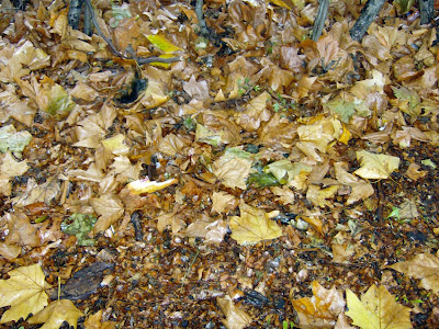
Today is Autumn
Friday, 16 October 2009
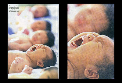
Photo Cropping Images
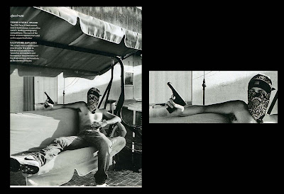
(-)cold
(+)successful
(i)aggressive
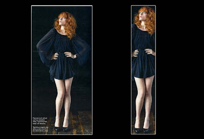
(-)easy
(+)better
(i)attractive
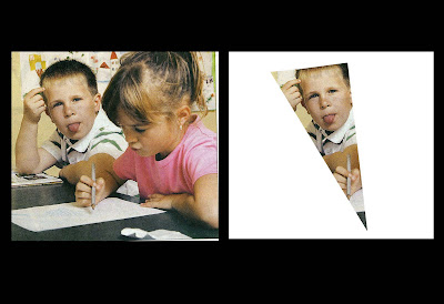
(-)empty
(+)alive
(i)strange
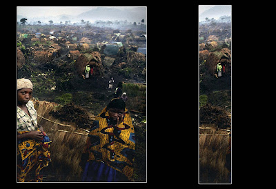
(-)lonely
(+)cute
(i)long
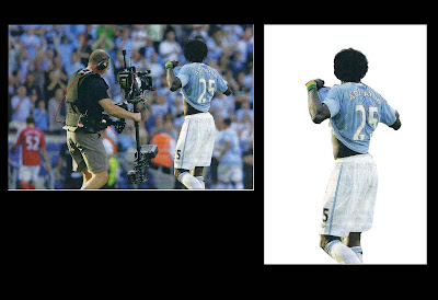
(-)silly
(+)alive
(i)exuberant

(-)damaged
(+)nice
(i)mute
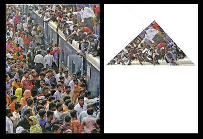
(-)silly
(+)crazy
(i)strong
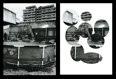
(-)confused
(+)puzzled
(i)different

(-)boring
(+)clean
(i)clear
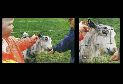
(-)flat
(+)plain
(i)quiet
-----------------------------------------------------------------------------------------------------------------
(-)scary
(+)real
(i)powerful
Tuesday, 13 October 2009
--POP ART--
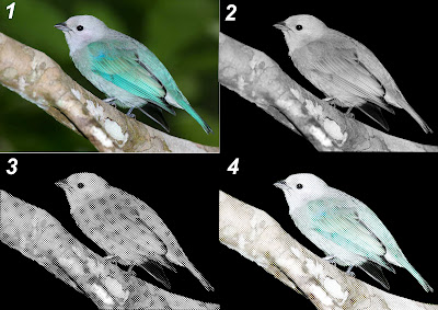
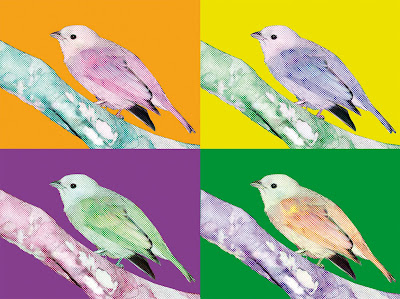 Image from internet (1). I traced the image using the path tool in photoshop and I saved it in EPS file, after that I changed the mode from CMYK in Grayscale (2) and I adjusted the contrast and the level to make stronger light and darker area.
After that I changed the mode in Bitmap (3) and with the halftone screen mode I create a nice effect transforming the image into a graphic image (4).
Finally I thought was nice to create a pop art.
In this workshop I discovered how we can create a nice graphic effect only with few step and selecting different image mode.
I look forward to learn more in the next workshop.:)
Sunday, 11 October 2009
WORKSHOP IMAGE
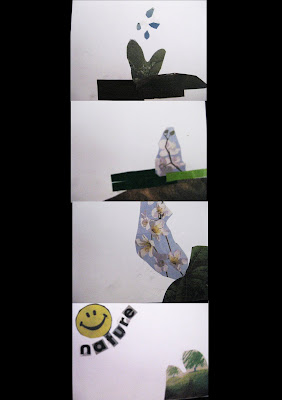 ---------------------------------NARRATIVE
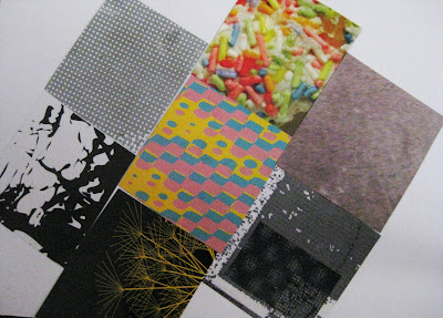 -----------------------TEXTURE
During the session I discovered how the art of collage can help develop artistic ideas in exciting and fun ways, it was very interesting for me to see how starting from one point during the process of collage it took me in the complete opposite direction.
Also, I loved working beside my classmate because by doing that I was able to study their techniques and possibly get some inspiration.....
Tuesday, 6 October 2009
Footprint in LCC
What is Graphic Design?
Subscribe to:
Comments (Atom)


