Sunday, 30 May 2010

Famous Logo Redesigns

I have assembled a remarkable collection of 20 redesigned logos.

Google logo


MTV Logo


Argos Logo


Skittles Logo


NET Logo


Missile Defense Agency Logo


Yellow Pages Logo


Netcom Logo


Rhapsody Logo


Library of Congress Logo


Scribd Logo


UEFA Euro 2012 Logo


Seattle’s Best Coffee Logo


Bausch&lomb Logo


Cousins Subs Logo


EU organic Logo


The State University of New York Logo


Ubuntu Logo


UK Space Agency Logo


Wikipedia Logo

Tuesday, 25 May 2010

Thinking

When I started the third term workshops I didn’t have any idea of what I was going to do for my Major project, but only after the end of all workshops I started to thinking of what I really like about London.

London has so many opportunities and various choices: museums, pubs, theaters but “the green” is what I like most it is something that reminds my place where I come from.

So I started to explore the green side of London, to collect things you can find in there, analyze them and then things went so easy. I 'm really enjoying this book because there isn’t any client so what I 'm doing it is to express myself of what I see, I feel and learn, It is fun, no stress at all.

What I liked mostly about the workshops it was using different materials, I love learning of new techniques, like cardboard boxes, Lego pieces, pictures, souvenir, using pen and scissors to create typefaces… we also had the possibilities to work in groups, thing really important for me, not only because we always learn something from each other, shares ideas but it’s a kind of practice for a future job where we’ll have to work with different people, so multiple ideas to get the final one.

I wished I could attend all the workshops because there were all interesting and creative and on each of them I learned something, but there were certain areas that I enjoyed most than others, which are the areas I’ll to take forward.

It is more challenge for me to create something from a piece of paper, crafty art (3d cardboard, vernacular, London character workshop) rather then using software (French fold, contrast workshop). What I thought before my first year in LCC Graphic Designer was a person with good skills in software and photography but it’s not what it is really important is observe, collect, analyze, compare and notice what is around us.

Monday, 24 May 2010

Characters leaves

When I took some leaves from my garden the only idea i had was to paint them to use a monoprint technique, after my final stage for the monoprint extension I didn't want to throw them away..
I went in a charity shop and I found this really small funny eyes, I got then an idea of creating some funny characters with different expression...

from one concept you can end up with multiple ideas!!...


The next stage would be doing some animation with them

I'm starting to get deeper of all my thought, I don't stop myself when I get the final first idea but Im always trying to see things on different point of view..
I wished I could have a bigger room, more light, more space and more free time for my creativity...


Sunday, 23 May 2010

Contrast in the park

I wish if you look at first to the video before to read.. guess which is the contrast between the images.
.

During my journey in the park I took many pictures, I didn't know which subject I was going to take for my contrast extension workshop..
I liked to looked really deep, every single details of the park, sometimes we are too busy to stop and look rally close of simple things..
then I noticed the circle shape and the straight line where the more common characteristic of my pictures... I compared not only the shape but also the natural shape and the one from the human made..


St. Jame's Park Cardboard


I love to look around wen I'm in St. Jame's Park.. not only for the beautiful flowers, the green, feeding the squirrels but especially for the view around the park..
There is something magic and really familiar to my place where I come from..

My idea is not finish yet I'll take some pictures outside in a garden wit the cardboard to make it more real...

Personal Souvenir


During the workshop what we discovered most of the time people buying souvenir only because is a usual habit to do when we visit new places..
We buy things to remember a specific place but it doesn't have any meaning, it's really simple and easy to go in a shop and buy something doesn't matter if it is nice or not, expensive or cheap.

So what I wanted to do it was to make my own souvenir from a specific place..
I went to green park and started to take some pictures..
I noticed a nice cafe', a bin with a lot of cups and beautiful flowers... so that's done!!..
why don't make a nice vase of flowers!! instead of waste all this cups if all of us could keep it and put something special inside found during the day... and give someone as a souvenir of you day..

Flowers all year in my room!! no matter the season!


MONOPRINT WITH FLOWERS

This is some work I'm doing for my monoprint extension..
I'm discovering so many techniques to play with shapes, colours, contrast, photos, real and paint... you don't have to be great in drawing or painting all you have to do is tracing!!!
I wished to have more space in my bedroom.. full up all my walls already..

Friday, 14 May 2010

Pattern


We had to design and make a pattern.

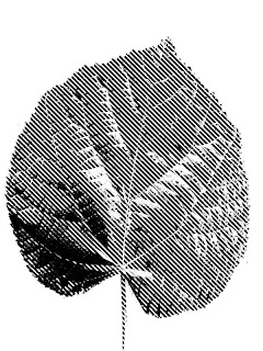
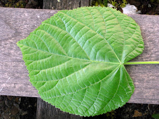
I took a shape of a leaf.

I used Photoshop to tracee the shape and playing with bitmap image to get the effect.

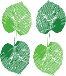
after that I opened the image in illustration and trace it again so that I could change the colour of it and flip it.

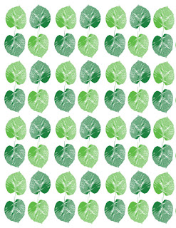
and in the end with Indesign I use the tool step and repeat to create the pattern.


It was really a useful and busy workshop, it feel so good when from small and simple step we can create something unique and creative.


After this workshop I went home and tried to make a pattern more careful similar to a pop-art.. Instead of using indesign I used photoshop another way of creating a pattern.. hue/saturation to change colour of it and clip mask for the bigger leaf.


London Urban Legends

In this workshop we had to read different famous London urban legends and focus on producing images and illustrations that explore these existing folk narratives, at the begging we underline the 10 most interesting and important words to describe the story.

1- Work off friday evening
2- drinking before heading off home
3- beautiful girl started chatting to him
4- taxi ride
5- they arrived at her hotel
6- the girl poured a glass of wine for both of them
7- the next day morning the man woke up in the bathtub of the hotel full of ice. on the wall was the note "if you want to live, dial 999"
8- he dialed 999
9-he was asked if a tube had been inserted in his back
10-the ambulance was on its way, one of the man's' kidneys has been removed

After that we illustrated them in 10 scenes, thinking of the point of view, the people, the background...


The final step was to decide the 3 most important scene that make the all story.


I liked this workshop because I'm not really good on drawing especially people, but even if it is not best illustration you ever seen you can still understand my point of view.

Tuesday, 11 May 2010

audio movie workshop

We use a conversation found on internet as a starting point and after we produced a piece of kinetic typography, using flash.
I found a small conversation of nemo cartoon.

Saturday, 8 May 2010

Workshop Statistic shapes

This workshop was useful to understand how many way there are to communicate statistics graphically by hand.

To get some ideas of what mean represent statistics we looked some example:


We decided to visualize the question How many people walk a section of the subway?
So we decided to analyze the Elephant and Castle subway.


After 20 minutes 100 people passed trough this way. We devided the data in 4 section (AB/BA, AD/DA, BD/DB, BC/CB)

After we got all the information needed we try to visualize the data using materials such as paper/card and legos (I got this ides because the texture of the wall it looks like it is being made with legos)
The blue logo represent the man's percentage and the red the woman's percentage

The colours white and yellow there are more contrasted with the background